Zitcha Product Update- Interface updates across plans, ad sets, and inventory
Small improvements that make everyday work in Zitcha easier
We’ve made a set of updates across the platform aimed at improving how things look, feel, and flow in day-to-day use.
Nothing fundamental has changed in how plans, ad sets, or inventory work. Instead, these updates focus on clarity, consistency, and making common tasks a little easier to manage.
Including:
- Cleaner headers across plans and ad sets, with key information easier to scan
- More consistent and clearer status with new consolidated colour indicators across the platform
- Improved visibility for Clashed and Paused states in Inventory views
- More flexible Inventory filtering by placement location
- Small usability improvements, including QuickJump search and clearer validation feedback
No time to read, click through our quick demo 👇
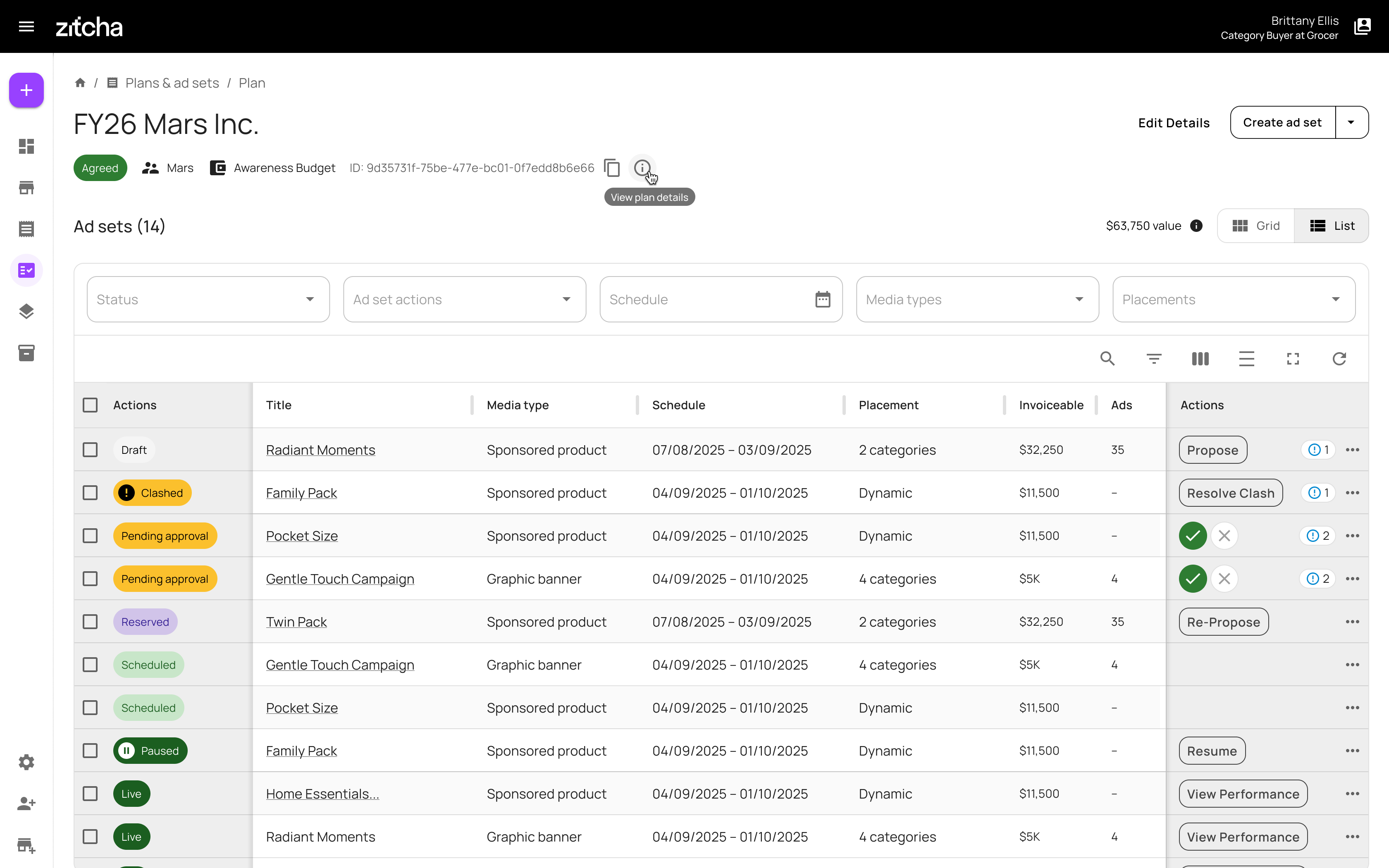
Cleaner headers for plans and ad sets
We’ve simplified the Plan and Ad Set views to focus on the information you’re most likely to need at a glance.
Plans
Plan headers now show:
- Plan name
- Status
- Advertiser
- Wallet
- Plan ID
Additional details, like creation dates or last modified timestamps, are still available, but they now sit behind a single View all details action. This keeps the main view cleaner and easier to scan.
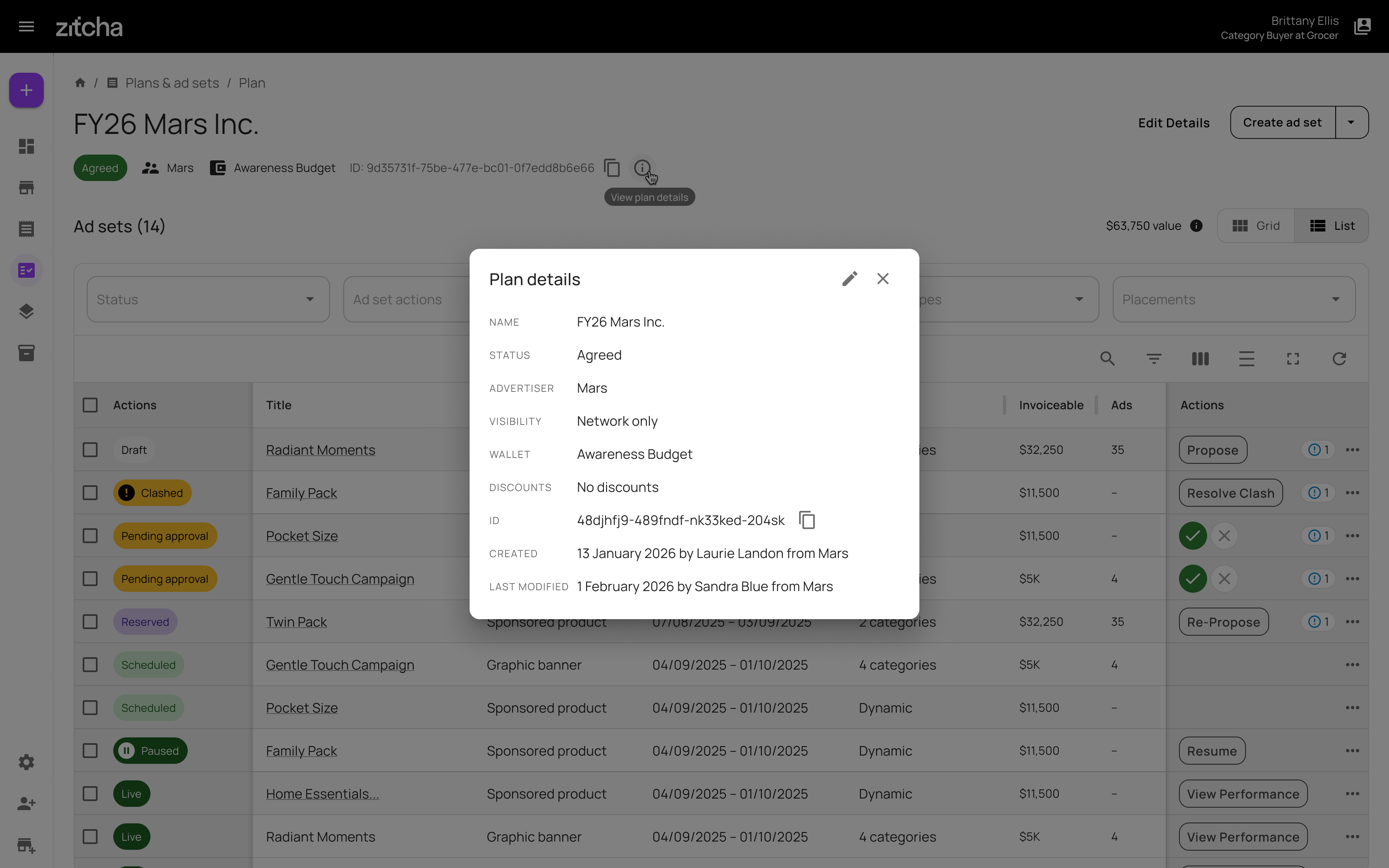
You’ll also notice that plan value now sits just above the ad set table. Since plan value is calculated from ad sets, this placement better reflects how it’s determined, while keeping the behaviour the same as before.
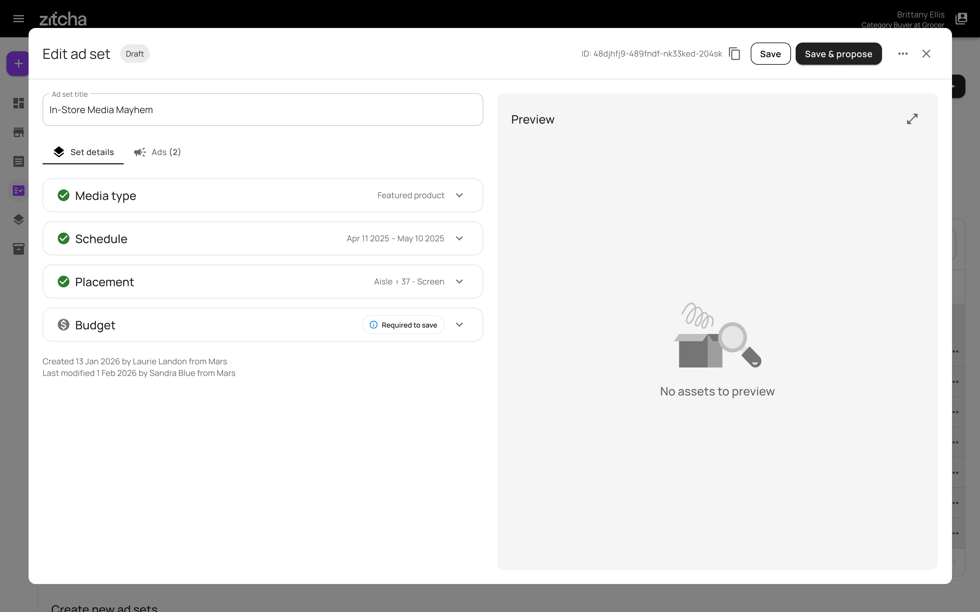
Ad sets
Ad sets follow the same approach:
- A simpler, more consistent header
- Status and ID always visible for reference
- Clearer distinction between edit and view states, making it easier to tell when you’re making changes versus reviewing saved information
Long ad set names are truncated where needed, with tooltips available to view the full title.
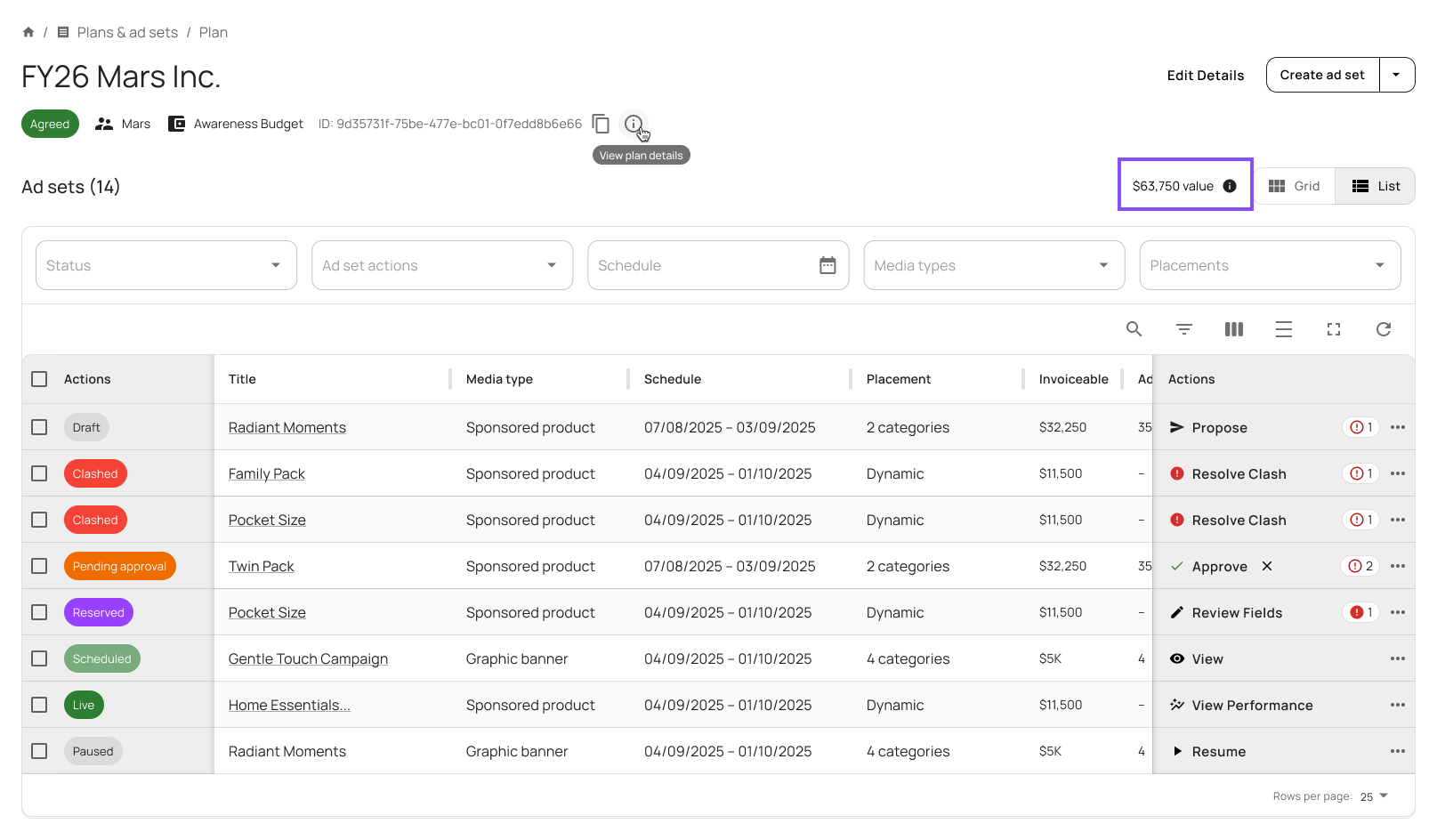
A consistent status colour system across the platform
We’ve also updated how status colours are used across Zitcha.
Previously, similar statuses could appear in different colours depending on where you were. Status colours are now consistent across the platform, so the same colour always means the same thing.
We now use seven colour groups, applied everywhere statuses appear, including Inventory, ad set lists, and status chips:
| Colour | Statuses | Example |
|---|---|---|
|
Grey Draft, Cancelled, Ineligible, Expired |
Draft | |
|
Yellow Pending approval, Clashed |
Pending approval | |
|
Purple Reserved |
Reserved | |
|
Light green Scheduled, Ready to deliver |
Scheduled | |
|
Dark green Live, Paused, Delivering |
Live | |
|
Dark grey Delivered, Ended, Done |
Delivered | |
|
Red Failed |
Failed |
This should make it easier to scan lists and understand item states without opening additional views.
Additional visual cues for Clashed and Paused statuses
While the colour system ensures consistency across the platform, we understand that Clashed and Paused require more immediate notice and, in some cases, action, particularly when scanning Inventory and list views.
To address this, we’ve added clearer visual cues that make these states easier to identify at a glance, without breaking the overall status framework.
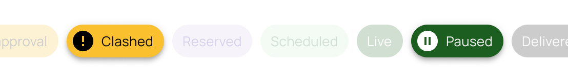
Clashed
Clashed items now include a stronger visual signal to indicate attention is required.
- A filled exclamation mark icon is prepended to the status chip
- The same icon appears in Inventory rows
- Colour remains aligned to the standard status system, with the icon providing additional emphasis
This makes Clashed placements easier to spot without opening individual items.
Paused
Paused has been updated to better reflect its behaviour within live plans and ad sets.
- Paused now sits within the Live status group
- The status colour is dark green with white text, instead of light green with dark green text
- A filled pause icon is prepended to the status chip and Inventory rows
This clearly differentiates Paused from Scheduled, while still signalling that the item belongs to an active setup.
Together, these refinements improve scannability and reduce ambiguity, especially when working at scale.
More flexible Inventory filtering
Inventory now lets you filter placements by location, all within a single view.
This makes it easier to narrow down large inventories and find the placements you’re looking for without jumping between drop-downs.
Plus: A few other UI improvements
Alongside the larger changes, we’ve made a few smaller updates that improve everyday use.
QuickJump now supports text search
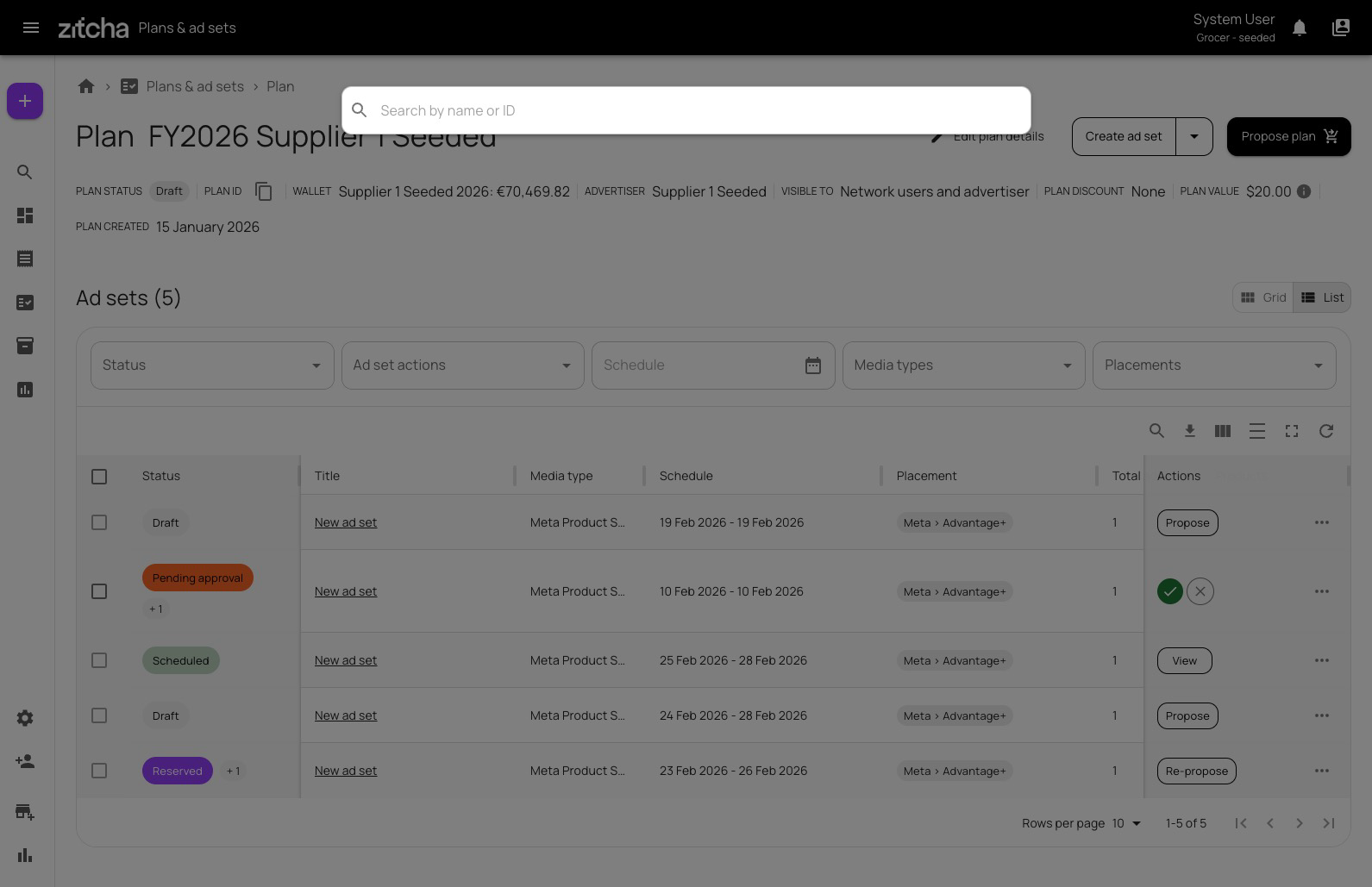
QuickJump can now search by plan or ad set name, not just by ID. Results are grouped and include helpful context, making it easier to find and open the right item.
You’ll also notice two small usability improvements:
- A QuickJump icon (🔎) has been added to open the search input directly
- The search input is now centrally positioned, making it easier to access and use
How to use QuickJump:
- Press Cmd + K (Mac) or Ctrl + K (Windows), or type /
- Start typing a plan or ad set name (minimum 3 characters)
- Click a result, or use the arrow keys and press Enter to navigate
Clearer inline validation feedback
Validation messages are now shown directly where action is needed:
- Tabs, ads, and fields display visual indicators when something needs attention
- Helper text explains what’s required before an ad can go live
This makes it easier to see what needs fixing and where, particularly when working across multiple ads.
Why these changes were made
These updates are about making the interface a bit easier to work with.
They reduce visual clutter, make status information more consistent, and surface important signals closer to where you’re already working. The aim is to spend less time searching for information and more time getting things set up correctly.
If you notice anything that could be clearer, or if something doesn’t work the way you expect, feedback is always welcome.